Casetify Redesign: Modernizing E-Commerce with GenAI
Role:
- Product Designer
Timeline:
- 14 Weeks
Focus:
- Mobile App Design (iOS), GenAI Integration, CRO
Prototype:
Summary
Casetify is a market leader in tech accessories, but their mobile application creates significant friction during the "Customization" phase—the brand's highest-margin funnel.
I executed a strategic redesign focused on Conversion Rate Optimization (CRO). By streamlining the navigation, establishing a consistent Design System, and integrating a GenAI Image Generator, I aimed to increase user engagement and reduce cart abandonment.
Solution
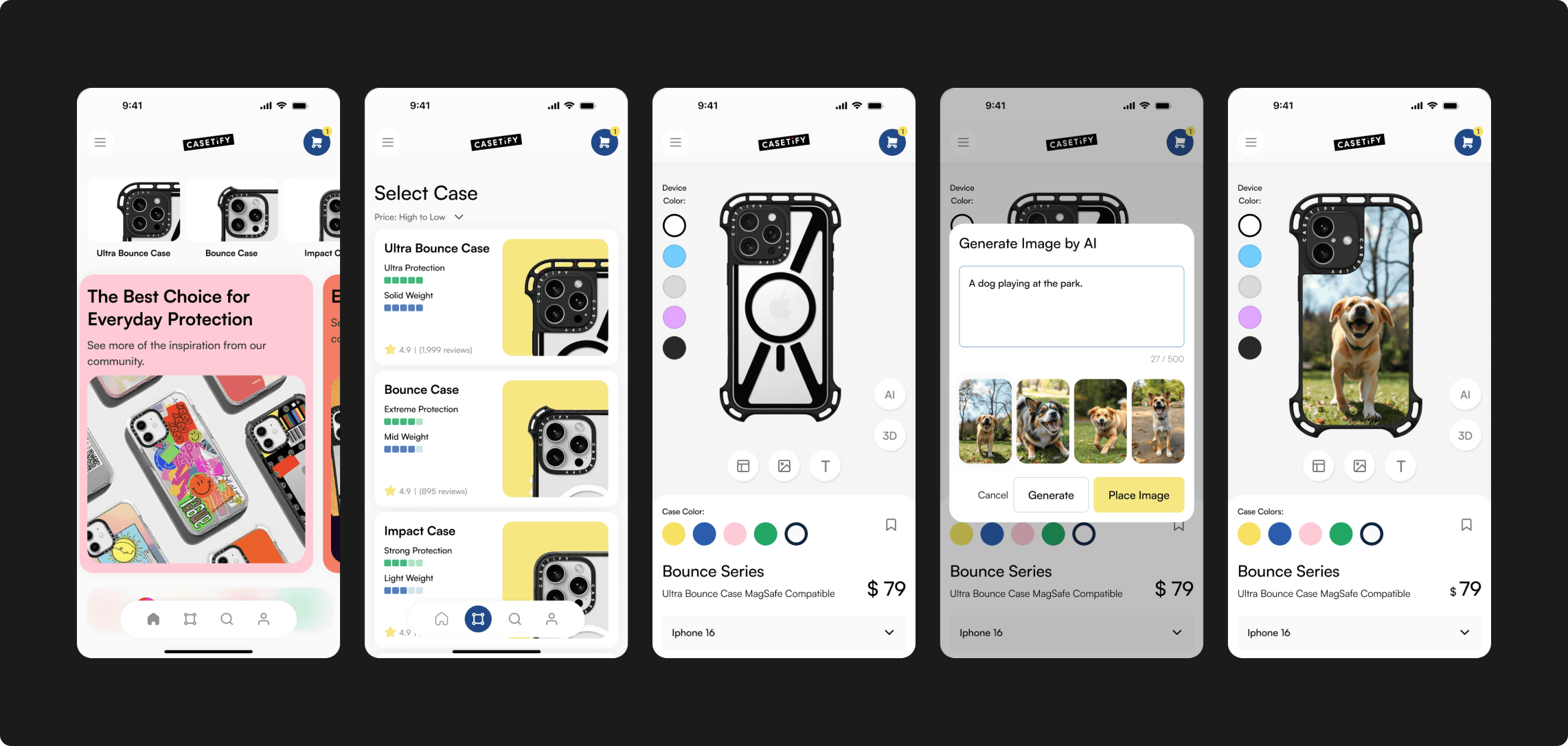
The AI Customizer:
A prompt-based interface allowing users to generate unique artwork directly onto a phone case model.
The Streamlined Product Page:
A restructured layout that prioritizes "Device Selection" and "Reviews" to reduce purchase anxiety.
The Modernized Navigation:
A standard tab-bar architecture replacing the legacy hamburger menu to improve discoverability.
The Heuristic Audit
Before designing, I conducted a Jakob Nielsen Heuristic Evaluation on the existing live app to identify objective usability failures. It wasn't just "outdated"; it was broken.
Key Violations:
- User Control & Freedom: Users were trapped in the customization flow with no "Back" or "Reset" options.
- Consistency & Standards: Icons varied in weight and style, and didn’t explain about the text
- Recognition rather than Recall: Product details were hidden until after design, forcing users to memorize specs.
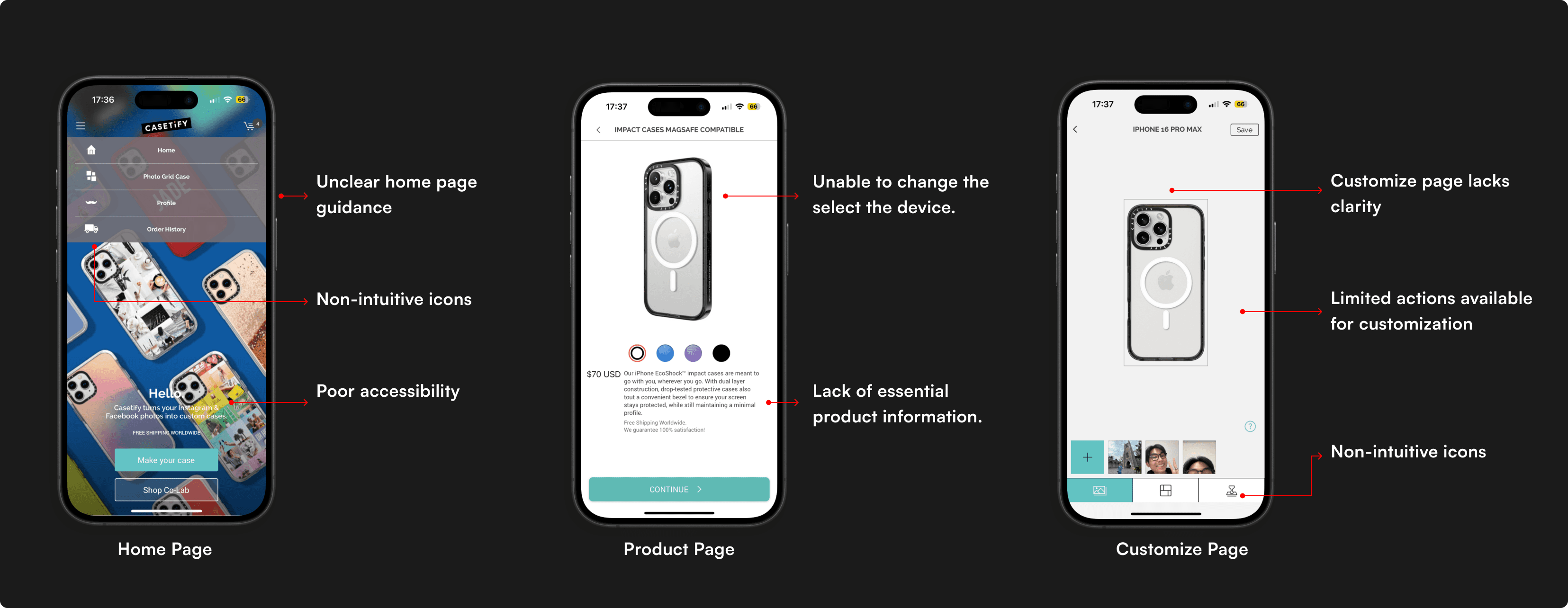
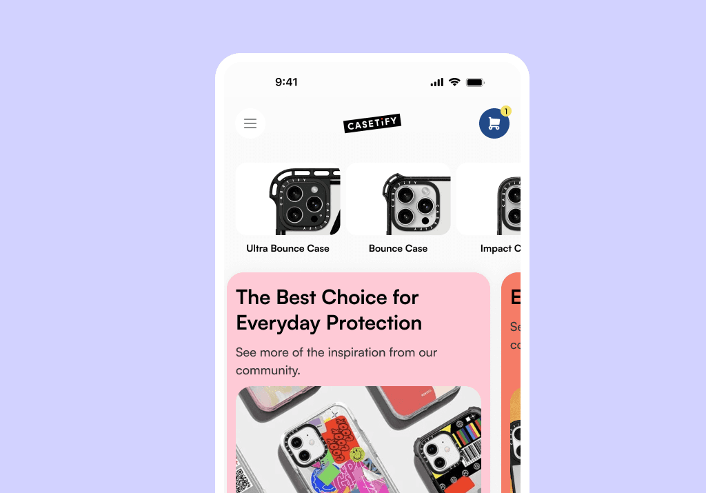
First Version of Casetify App
Business Strategy
The Problem: Users want unique cases but often lack the design skills to create them from scratch. This leads to "Blank Canvas Paralysis" and drop-off.
Goal: Increase "Time on App" and "Customization Completion Rate."
How might we utilize Generative AI to lower the barrier to creativity, allowing non-designers to create bespoke products in seconds?
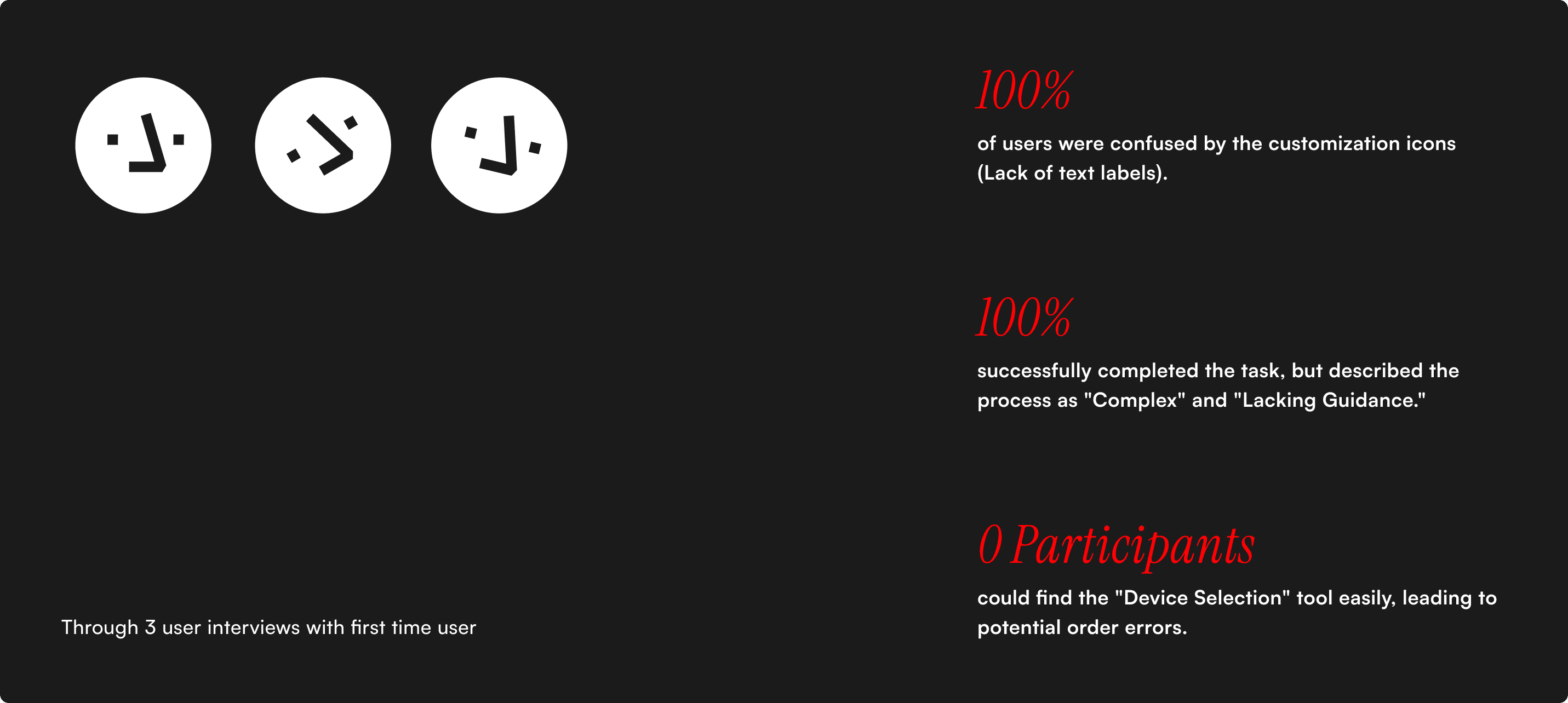
User Research
Three existing Casetify users tested the new design. While all participants were able to complete the main task, there were some minor usability issues affected the experience. Their feedback highlighted both design improvements and feature expectations.
The Baseline Metrics:
- 100% of users were confused by the customization icons (Lack of text labels).
- 67% successfully completed the task, but described the process as "Complex" and "Lacking Guidance."
- Zero participants could find the "Device Selection" tool easily, leading to potential order errors.
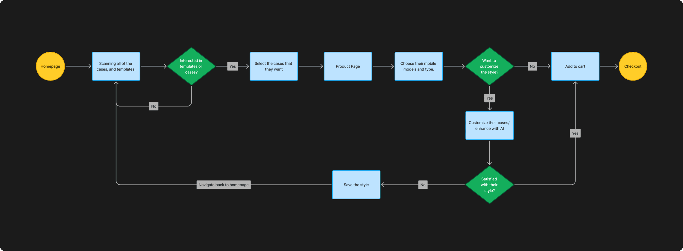
Interaction Architecture & Wireframing
To fix the navigation, I flattened the hierarchy.
The User Flow:
- Old Flow: Design → Device → Checkout (Risk: User designs for wrong phone).
- New Flow: Device → Design/AI Gen → Checkout (Benefit: Error prevention).
The Iteration
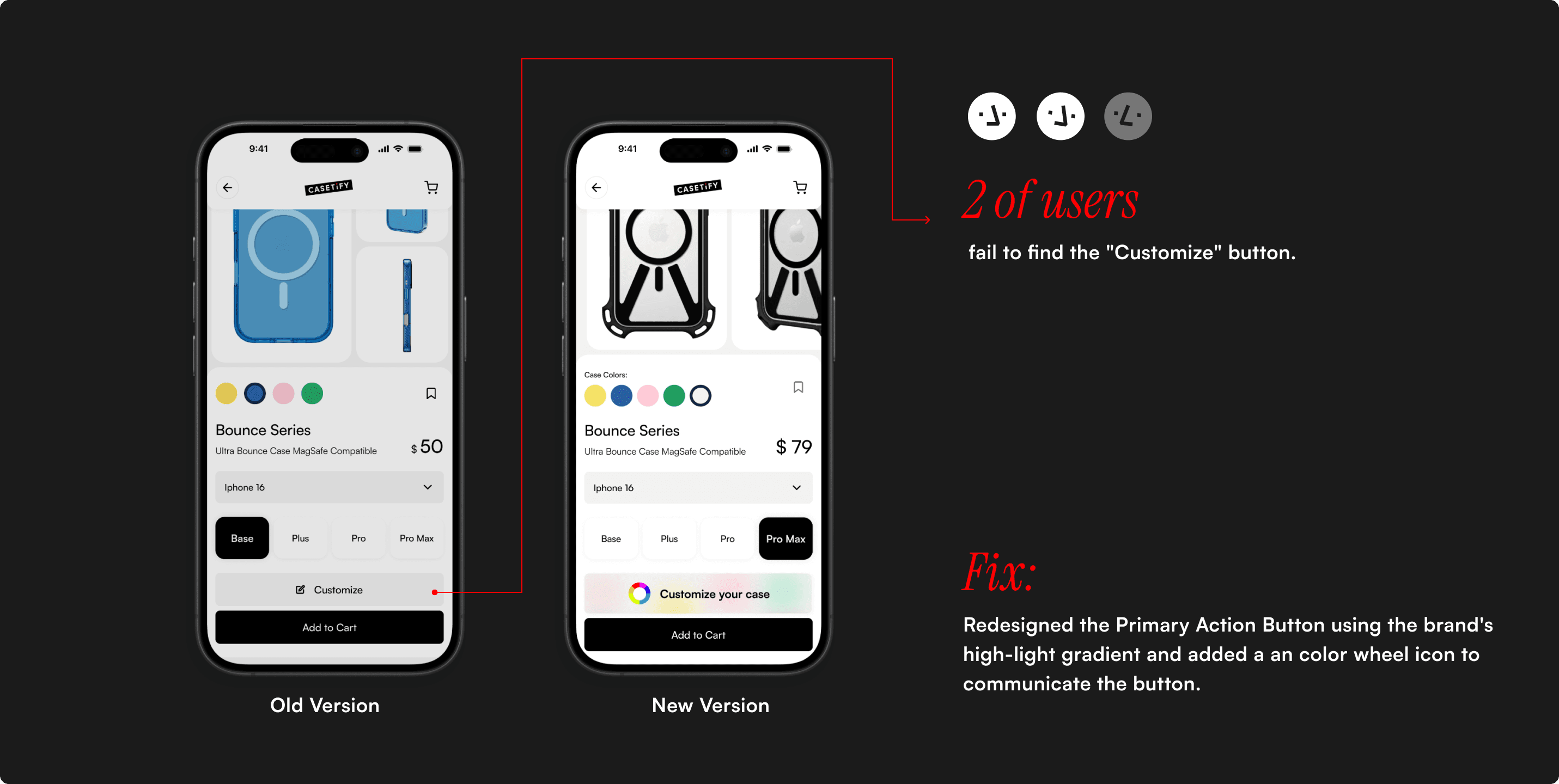
I conducted a validation test on my V1 High-Fidelity prototype. While task completion rose to 100%, I introduced a new critical error.
The Failure:
- 67% of users struggled to find the "Customize" button.
- Root Cause: I used a low-contrast aesthetic (Grey on Black) to look "sleek," but it failed WCAG accessibility standards.
The Fix: I redesigned the Primary Action Button using the brand's high-light gradient and added a an color wheel icon to communicate the button.
The GenAI Integration
The flagship feature of this redesign. I designed the prompt interface to be conversational, not technical.
The Interaction:
- Input: User types "Cyberpunk City."
- Generate: AI creates 4 variations.
- Apply: User taps a variation, and it wraps the 3D phone model instantly.
Reflection
Redesigning a live product taught me that "New" isn't always "Better" unless it's accessible.
Key Learning:
My V1 design looked "cleaner" but performed worse on visibility. This reinforced that Accessibility is not a constraint; it is a baseline requirement for conversion.
Future Roadmap:
I would further explore "Community Prompt Sharing," allowing users to share their AI recipes, creating a network effect within the app.