Upliftt: Closing the Loop Between Trainers and Clients
Role:
- Product Designer Intern
Team:
- 1 Designer (Me), 1 CTO/PM
Timeline:
- 14 Weeks
Platform:
- iOS Native
Summary
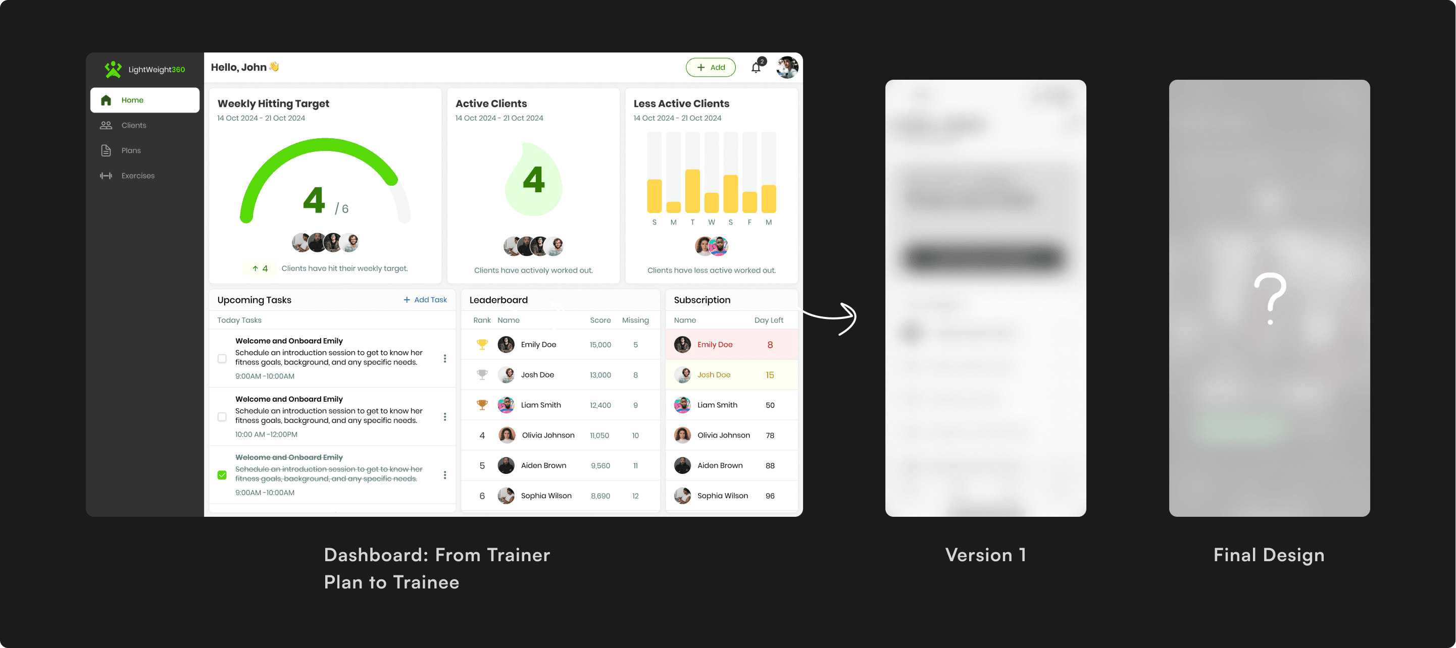
Upliftt is a CRM platform empowering fitness professionals to manage their business. However, the ecosystem had a critical gap: while trainers had powerful tools to create plans, clients lacked a dedicated interface to execute them.
I led the end-to-end design of the Upliftt Client App, an iOS experience designed to translate complex trainer data into a simple, habit-forming user journey from 0 → 1. I delivered a fully scalable design system (Light/Dark mode) and high-fidelity dev-ready specifications.
Solution
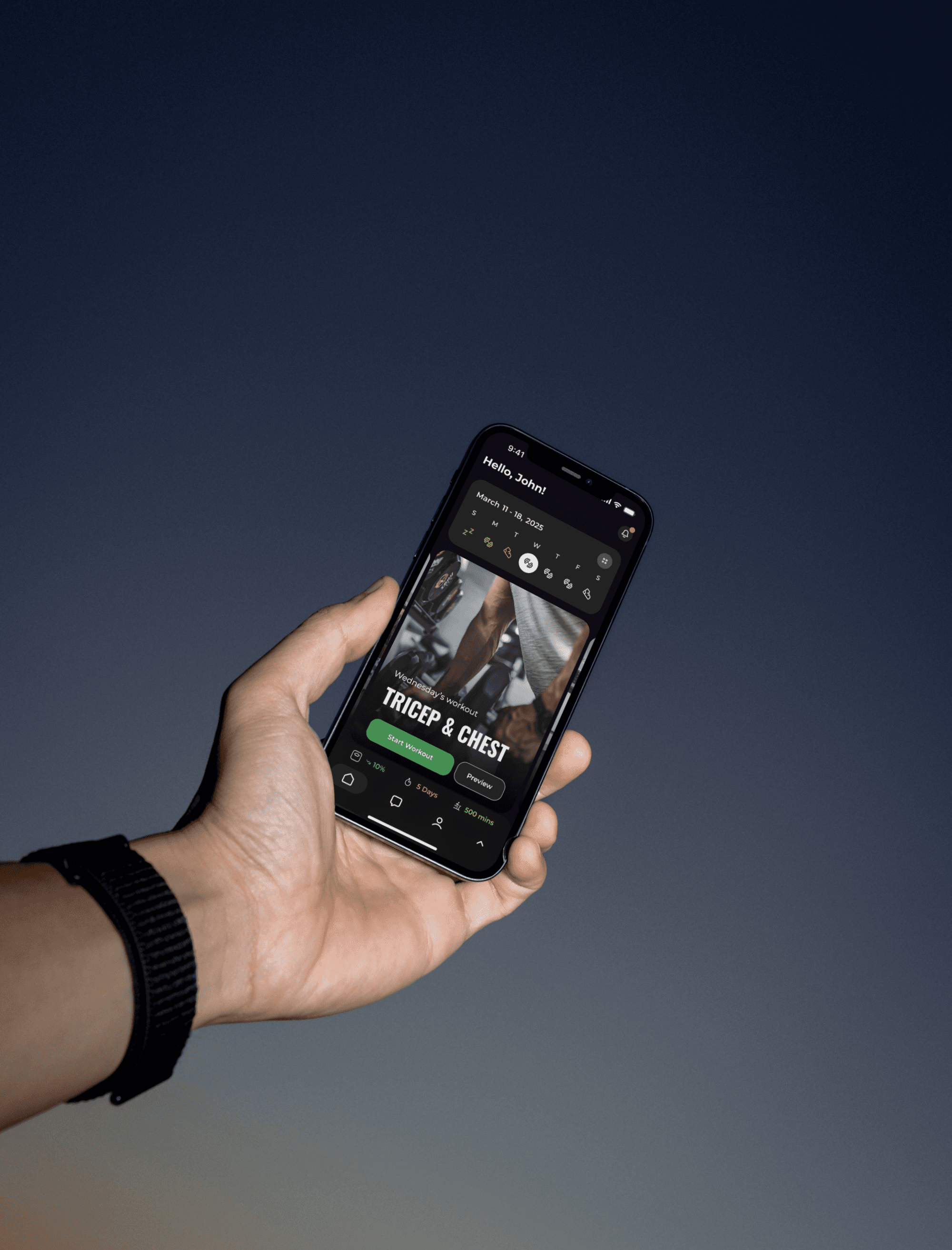
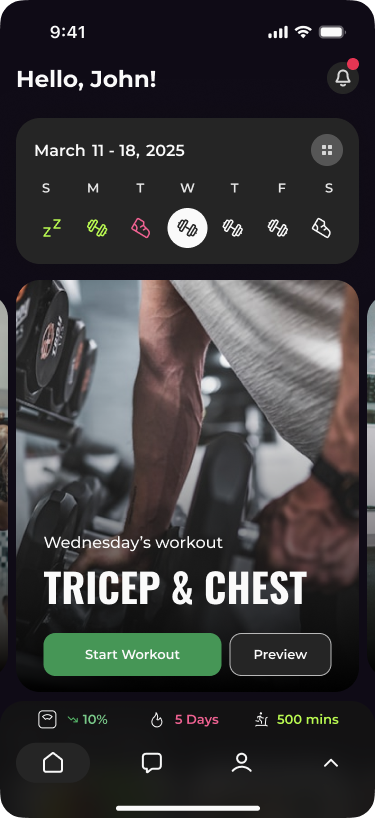
The "Smart Calendar" Dashboard:
A toggle-based view that simplifies a client's weekly schedule into clear, color-coded actionable days.
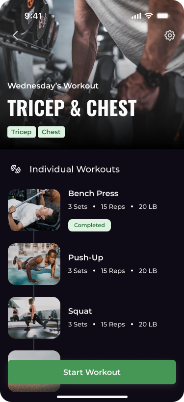
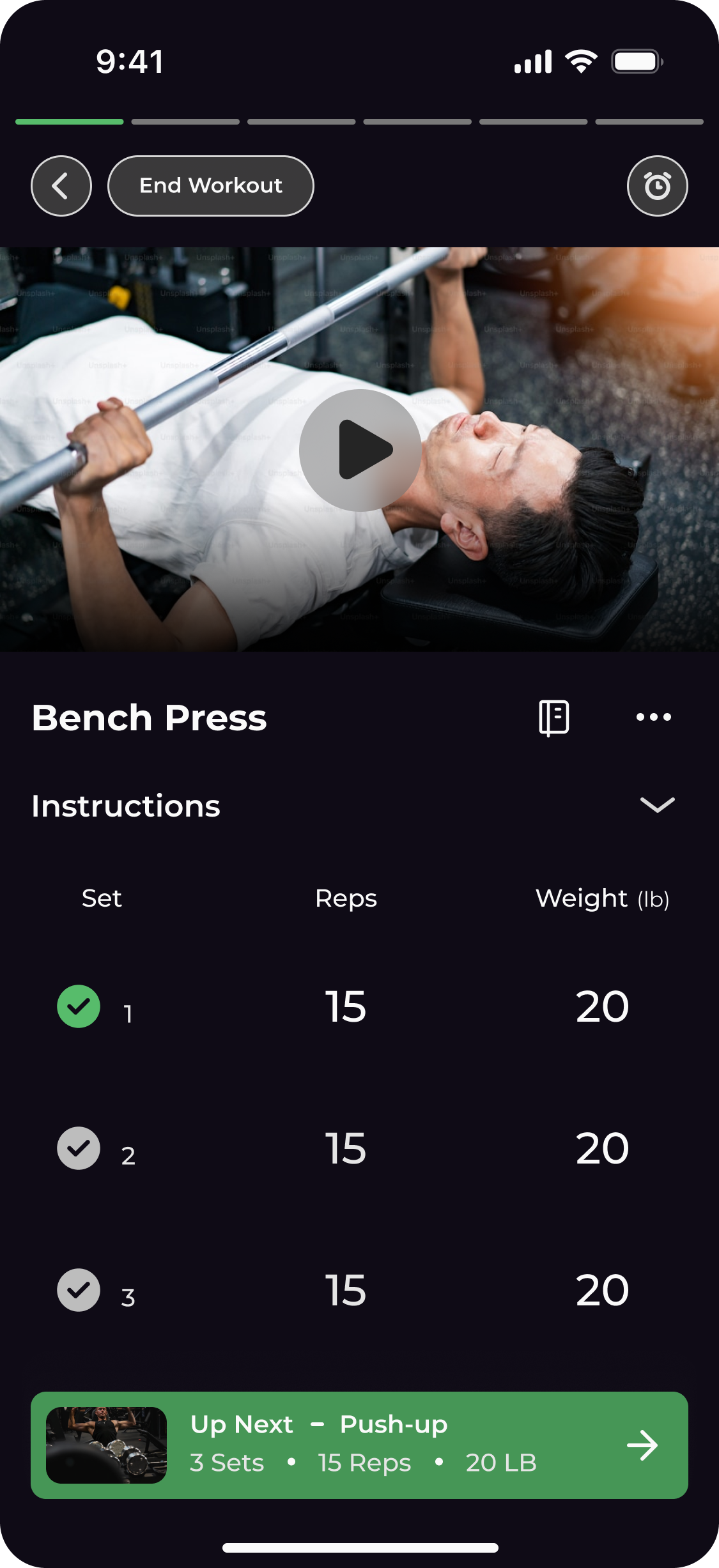
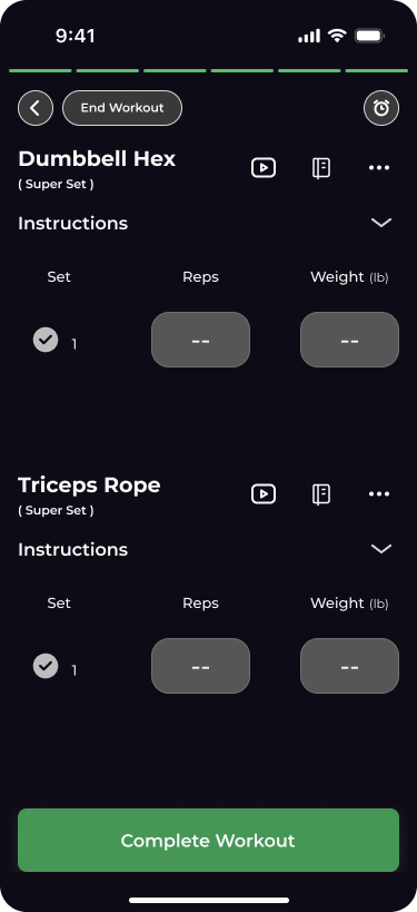
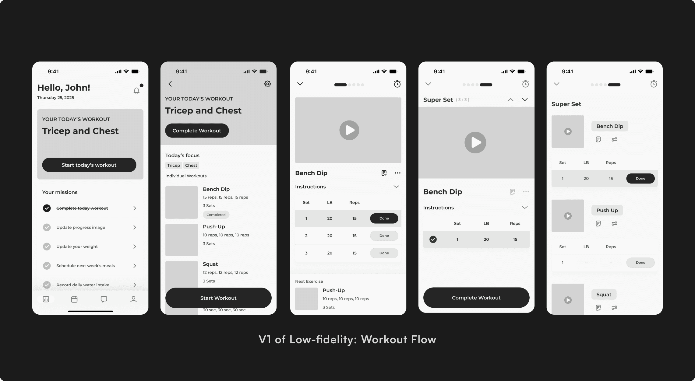
The Linear Workout Flow:
We replaced complex spreadsheets with a focused, carousel-based interaction that guides users one exercise at a time.
Interactive Meal Tracking:
A gamified checklist that uses satisfying micro-interactions to encourage diet adherence.
Business Challenge
The Upliftt CRM value proposition relies on client retention. If clients find the workout plans hard to access or confusing to follow, they churn, and the trainer stops using Upliftt.
Trainer Side:
Trainers use a powerful, data-dense CRM to build complex programs. The output is often a raw spreadsheet or a long list of exercises.
Client Side (Missing):
Clients are often overwhelmed beginners who need low friction, high motivation, and zero ambiguity to start their workout.
How might we design a client-facing interface that reduces the cognitive load of "working out" to zero, ensuring clients stick to the plans their trainers create.
Understand the Users
We identified two distinct user archetypes with a shared problem: Cognitive Overload.
The Busy Professional:
Has motivation but zero time to manage logistics.
The Novice:
The Novice: Has time but lacks confidence and knowledge.
The Physiological Constraint (Scenario-Based Design):
We modeled the user experience based on a "High-Exertion State" scenario.
- Scenario: Physical fatigue compromises fine motor control (shaky hands) and depletes cognitive resources. Users literally have less brainpower available for UI navigation mid-set.
- The Design Implication: The interface must be Error-Tolerant. We mandated Hyper-Legible Typography and Touch Targets 48px to ensure successful interaction even when dexterity and lighting are compromised.
What I tried to achieve: I need to put the app out of the spreadsheet of exercise styles, but to design a turn-by-turn navigation system for their health, and make it easier for them to use and guide them during the workout.
The Design Frameworks
The founders provided a clear feature roadmap, but my role was to structure these features into a cohesive experience. I established three core principles to guide every decision:
- The Challenge: The app needed to display complex data (Reps, Sets, RPE) without looking like a spreadsheet.
- The Execution: I utilized "Progressive Disclosure" in the Carousel View, showing only today's workout and hiding future complexity.
- The Challenge: If tracking is hard, users stop doing it.
- The Execution: I prioritized Low-Fidelity Prototyping to test input speeds early. I skipped paper sketches and moved straight to Lo-Fi flows to validate that the "Meal Completion" flow needed to be a single tap.
- The Challenge: Beginners often freeze when they don't know "what's next."
- The Execution: I connected the Smart Calendar directly to the workout feed, acting as a "Map" for their fitness journey.
The Design Evolution
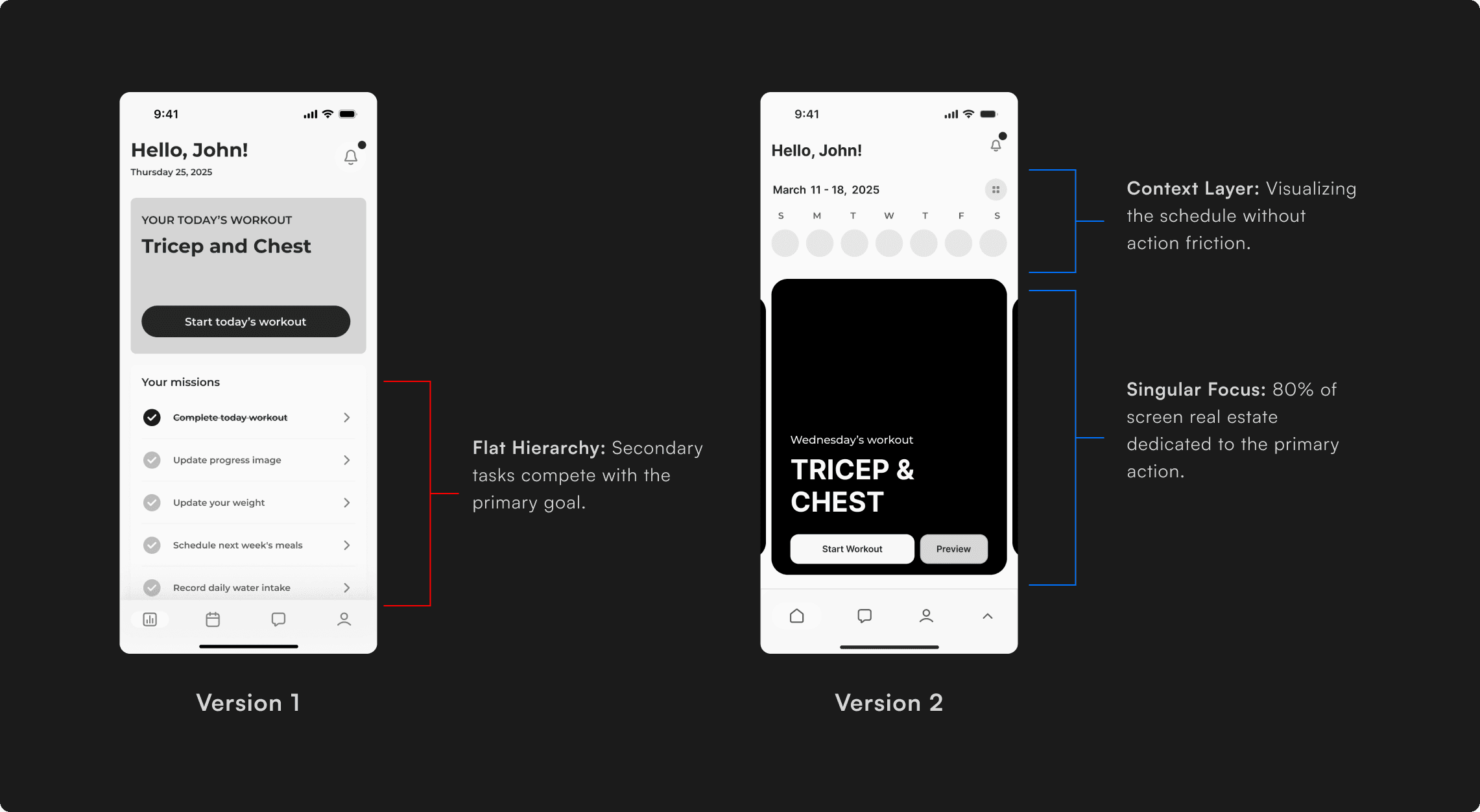
The Hypothesis of Home Page:
The Hypothesis of Home Page: My initial wireframe was a rigid "Daily View." It showed the user exactly what to do today, but locked them out of the broader context. They couldn't easily look back at yesterday's stats or preview tomorrow's leg day.
The Friction:
Testing showed that while users need focus during a workout, they need flexibility when planning their week. The "Static" view made them feel trapped in a blind tunnel.
- The Interaction: Swiping the carousel automatically updates the calendar date, and tapping a calendar date snaps the carousel to that specific plan.
- The Value: This gave users "Temporal Context" the ability to audit past performance and mentally prepare for future workouts without leaving the main dashboard.
The Final Design Decisions
The "Smart Calendar": Reducing Decision Fatigue
The calendar uses icons in the weekly view and color-coded dates in the monthly view to show the user's workout, cardio, rest days, and progress. It gives a quick, visual summary that helps users stay on track without needing to tap around.
Workout Execution: Linear Focus
The swipeable carousel syncs with the calendar and lets users preview or start workouts for each day. It adds structure and routine, making it easy to focus on just today's plan.
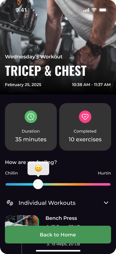
Progress Tab & Stats Summary
The tab bar includes key data like weight lost, weight left, and total workout time with an expandable dropdown for a full progress breakdown. This encourages habit-building by showing results without overwhelming the user.
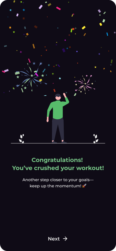
Meal Tracking: Gamifying Nutrition
Diet adherence is often harder than exercise. I utilized micro-interactions to make logging food feel rewarding rather than administrative.
Tokenizing for Scale
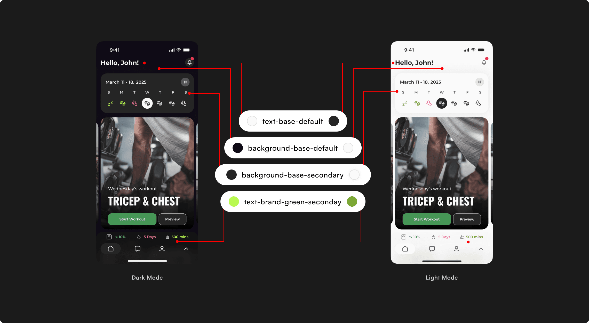
The Requirement:
The app needed to support both Light and Dark modes from Day 1 to accommodate different gym environments. Hard-coding hex values would make this a development difficult.
The Execution:
I built a semantic color token system. Instead of assigning Black or White to backgrounds, I assigned functional roles.
- Light Mode Value: #F5F5F5
- Dark Mode Value: #252525
- Light Mode Value: #252525
- Dark Mode Value: #F5F5F5
The Impact:
This documentation allowed the developer to implement the Dark Mode theme switch in a single sprint with zero design debt, ensuring the app was accessible in low-light environments immediately upon launch.
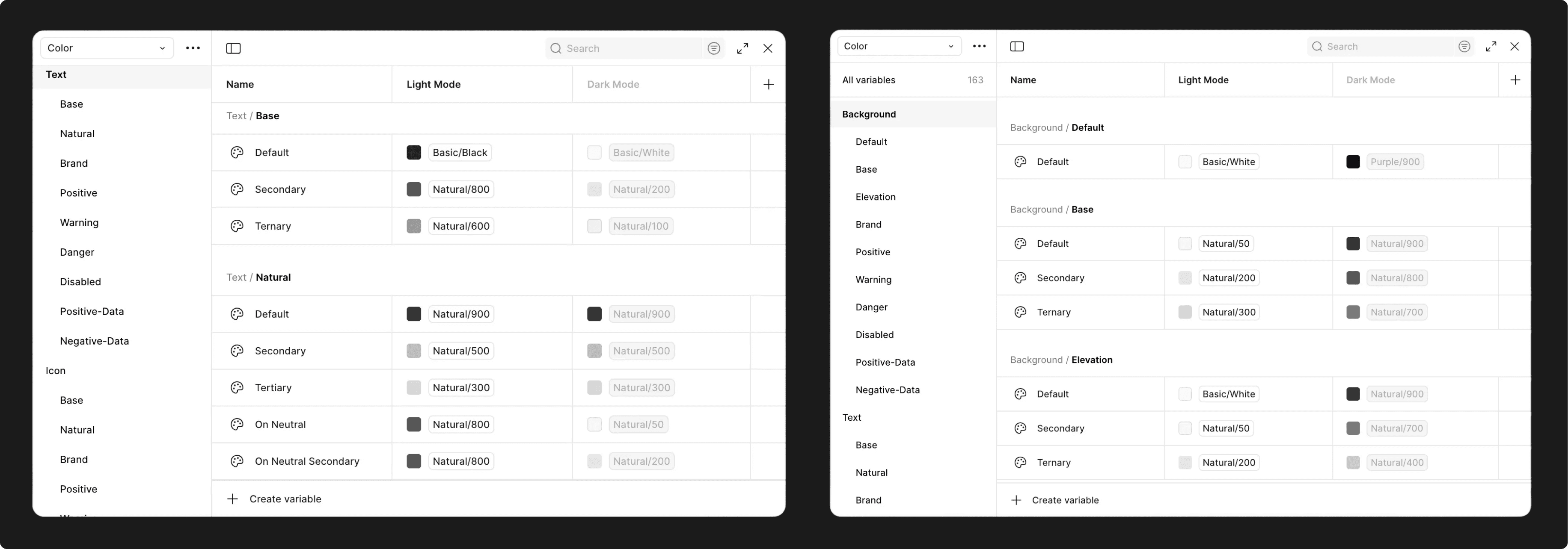
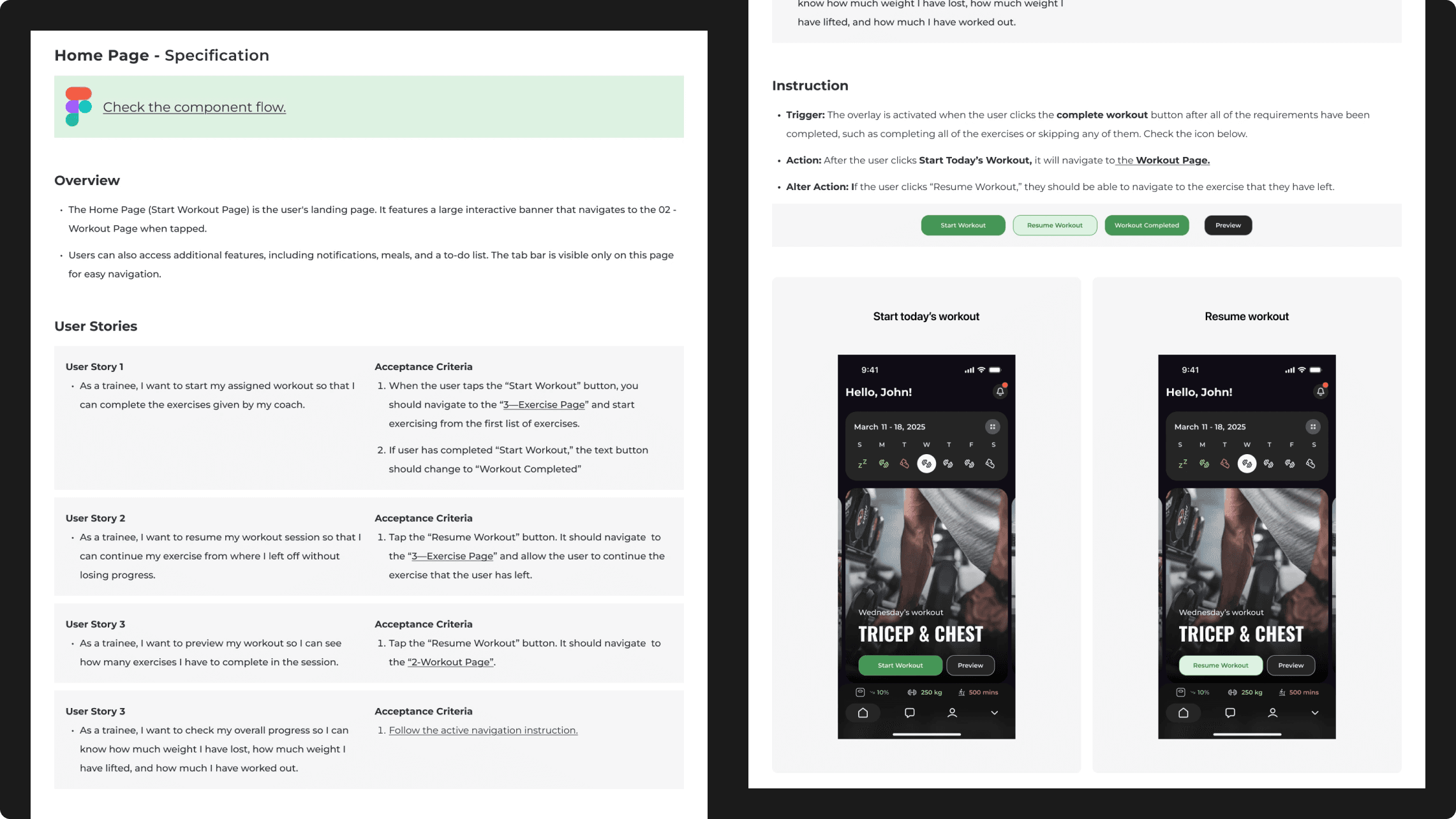
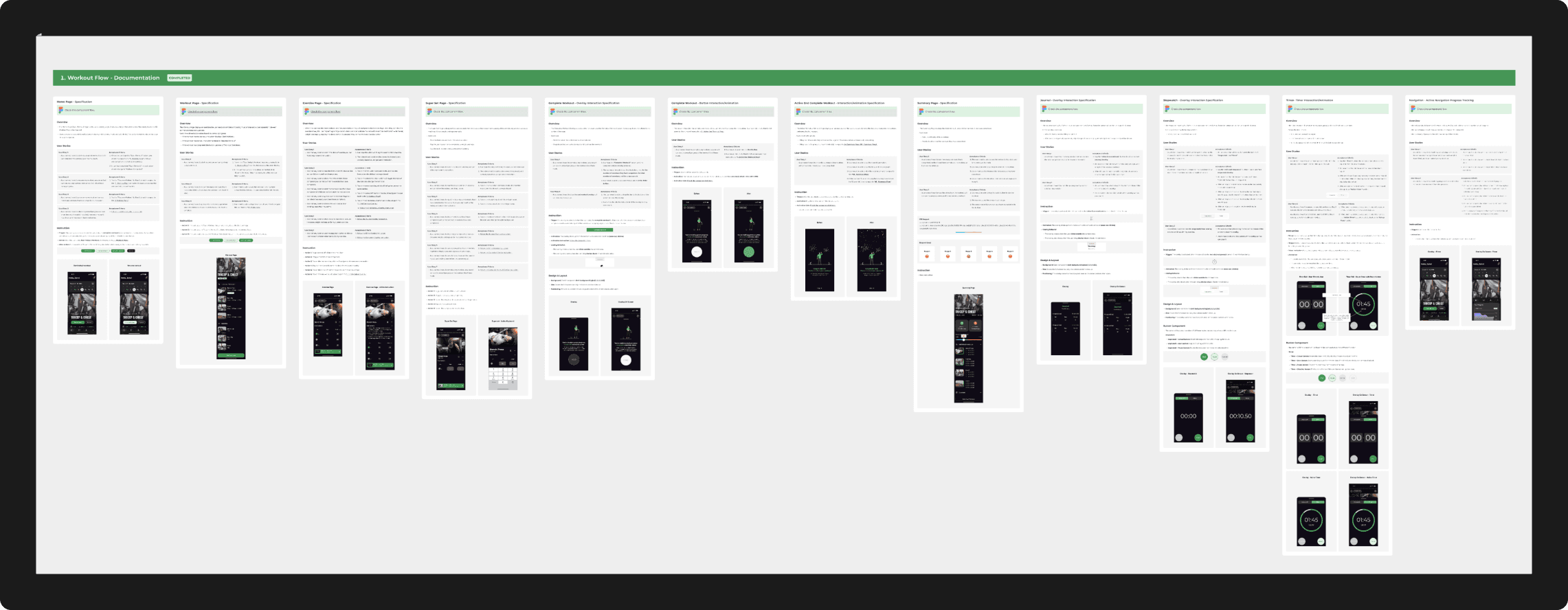
The Handoff
To support development, I worked closely with the CTO to define a clear, readable documentation format. The handoff page breaks down the rationale and flow of each design section so that both developers and non-technical stakeholders can understand the intention behind every feature.
Retrospective & Impact
While the app is pre-launch, the design successfully solved the "Delivery Gap" in Upliftt's ecosystem.
Key Outcomes:
- System Readiness: Delivered a 100% reusable component library, reducing future design debt.
- Stakeholder Alignment: The high-fidelity prototypes were used by the founders to pitch the platform to early investors.
- Accessibility: Full compliance with contrast ratios across both Light and Dark themes.
What I would do differently:
If I had more time, I would focus on "Social Accountability" designing features for trainers to send real-time "kudos" or feedback directly into the client's workout stream to further increase retention.